1. Define challenges
Smarter data = more efficiency
Each year, UNHCR makes budgeting and resource allocation decisions that affect millions of lives. From ordering the right number of tents to planning on how to protect children during humanitarian emergencies, these are decisions the agency has to get right. Making such decisions rests on having the right information and being able to interpret it smartly.
Although it had a results framework already, protection officers working on specific Protection strategies were spending an enormous amount of time pulling from several disparate databases to get the full picture for the topic they were looking at, whether education, gender based violence, or child protection
Moreover, there was no easy way to visualize that data—instead staff practically needed computer-programming knowledge to draw out the answers to important questions like which initiatives were performing well and which were over budget.
UNHCR Protection staff wanted a better way to see and understand that information on a daily basis so that they could build insights over time and make adjustments in the way the organization served refugees and displaced people.
2. Identify solutions
Visualising data for better analysis
UNHCR’s Division of International Protection and Education Unit worked with our Link Lab in order to build something that would tackle the data visualization and data-use challenge. In partnership with the Education Division, a four-person team came up with an internal tool it called Axis.
The site allows for easy analysis of all this information using filters and search functions, bringing an incredible amount of functionality and customization that UNHCR had never enjoyed before.
Something Axis offered that sounds simple but was actually quite an achievement was creating a way for staff to see how budgets compared to their strategy’s real performance.
Another big selling point of the tool was its ability for these units to monitor strategies, pick objectives, indicators, and country data to analyze, all within the Axis platform.
This allows for concrete but flexible strategy creation in a way that is measurable. UNHCR had never had a tool like Axis before.
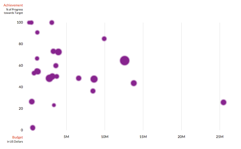
Axis screenshot – visualizing data helps UNHCR staff better analyze key targets.
3. Test solutions
Starting over from scratch
To start testing Axis, the team built a concept map of the website with what they wanted it to show, and the pieces of information it thought would be most important to other staff.
They talked to people who used data frequently—mostly program officers responsible for putting together budgets or staff who are requested to craft new policies—and ran it by them to get feedback.
With more insight into what solution might work best for the people who would be using it the most, the Axis team built an initial website for them to actually see and use.
Then, they watched how their colleagues used the prototype system. One Geneva-based unit that focused on protection volunteered to try Axis out, and used it to find and analyze information for its annual report.
These pilot users evaluated how easy Axis was to navigate, use to find and visualize information, and translate into products that UNCHR used all the time. They provided feedback via emails and a survey.
And with those results, the Axis team started over again. Practically from scratch.
4. Refine solutions
User-friendly and smart
The concepts behind Axis were sound, and users loved the opportunities it presented. But feedback showed that with a few fixes, Axis would be even more user-friendly and powerful.
The Axis team completely redid the interface based on user feedback to make it simpler and ensure that people had ready access to just the kinds of information they were looking for.
It also completed a redesign including a better dashboard to make the site more attractive and easier to navigate with even higher functionality. Now Axis allowed people to get to the information they wanted to see more quickly.
Next, the team added another component to Axis: a way to include narrative information to the data that provides more context and explanation. Staff members using the site could submit their own comments and details as a way to create a robust and understandable dataset.
Even more, Axis included a built-in summarizer to avoid the clutter that too much user input can create. By figuring out the most important sentences and how often key words are repeated, Axis can determine the most important narrative components being added by users and aggregate them into a summary.
To combat the ever-present issue of data quality, the team even implemented a flagging system within Axis that alerts users to data that doesn’t seem right or begs a bit of extra checking. Axis highlights this data and notifies the user so that they are informed and can call the unit that collected the data to clarify.

5. Scale solutions
Collecting mobile data?
Axis was introduced at UNHCR Headquarters in Geneva to start. But its developers believe the tool is now ready to be introduced to many more UNHCR staff members in field operations around the world.
So far the adoption rate has been excellent, with the number of users quickly doubling to about 55. Four UNHCR units have used Axis to craft their own strategies to address child protection, education, gender-based violence, and livelihoods.
Over time, these units will be able to use Axis to see how well they are implementing these strategies using specific indicators in key places. And they will be able to budget, organize, and re-address according to what the data shows.
In prospective iterations, perhaps Axis could even tie in to a mobile data collection application that would feed directly into the database for real-time visualization and analysis.
That kind of integration is well in the future. But the team that developed Axis knows this is just the beginning for a tool that can help units make recurring, essential decisions. It is already empowering decision makers to make data-driven decisions that are improving UNHCR’s ability to serve the communities it is entrusted with. They think eventually Axis could benefit thousands of UNHCR employees do their jobs better, faster and more accurately.